I like that you keep your shop announcement short. It helps get those items into the viewer's eyes immedately!
I like that you use solid, colored backgrounds for your photos. It's nice to see a clean background that doesn't compete with the item you are selling.
You might want to consider using hues of similar intensity, like those that you use in your featured items right now. The softer hues do work well in your shop. The You Are So Lovely and Birdie Birthday Cards do jump out, but it seems that the neighboring products lose visibility next to those items' backgrounds. Try using the softer hues to see if it helps generate a more cohesive vibe in your shop.
A couple notes about shop sections:
Removing spaces between the letters in your shop section names will actually help Search Engine Optimization, i.e. Google will more likely pick it up.
If you have empty shop sections, consider combining smaller sections and removing empty sections to give the feeling that your shop is "fuller". An empty section may not leave the best impression on a buyer. You can always add a section later if you need to, and Etsy doesn't require you to place your items in a section at all.
Over all, you do have a very lovely shop. It exudes a soft, feminine elegance. It definitely makes me feel that I am truly in a card boutique!
I don't really feel like I can pinpoint any particular area that needs improvement. I think the overall shop appearance is beautiful - nicely photographed, etc.
Here is one article that I really appreciated when I first started listing.
I have referred to it a number of times and I think it'll be helpful here.
LOVE your shop Ahna! Pretty hard pressed to find anything to critique about it, but I did find one thing.
I noticed that on one of the items I clicked on, you didn't use up all your tags. I've found that putting my location and or state when I'm hard pressed for tags has gotten me a sale or two (and even got me into a Gallery!).
I too like the macro shot I think that it helps pull people in to look more closely when it shows up in the listing. At least that works for me.
My only caution is to make sure that your brightness on your white items you photograph doesn't wash away the detail. I know this is a tough one to balance between to bright & too dark, but especially with some of the paler backgrounds you lose the detail when the image is smaller. i.e. flat embossed note cards, http://www.etsy.com/view_listing.php?listing_id=25168390, friendship bday card http://www.etsy.com/view_listing.php?listing_id=29045352 Holiday gift tags, http://www.etsy.com/view_listing.php?listing_id=17996164 One that shows up better and perhaps it's more placement in the light is the delightful pink note tags, http://www.etsy.com/view_listing.php?listing_id=24539312 When you look at the shop page that embossing is much easier to pick out than the others.
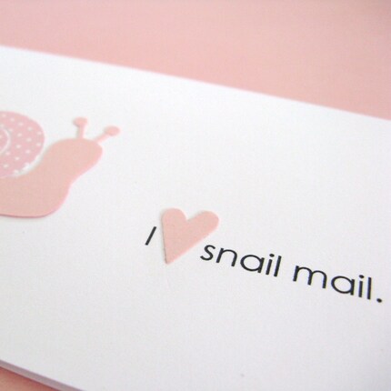
I like the macro shot which allows the details to be clearly seen.
ReplyDeleteI like that you keep your shop announcement short. It helps get those items into the viewer's eyes immedately!
ReplyDeleteI like that you use solid, colored backgrounds for your photos. It's nice to see a clean background that doesn't compete with the item you are selling.
You might want to consider using hues of similar intensity, like those that you use in your featured items right now. The softer hues do work well in your shop. The You Are So Lovely and Birdie Birthday Cards do jump out, but it seems that the neighboring products lose visibility next to those items' backgrounds. Try using the softer hues to see if it helps generate a more cohesive vibe in your shop.
A couple notes about shop sections:
Removing spaces between the letters in your shop section names will actually help Search Engine Optimization, i.e. Google will more likely pick it up.
If you have empty shop sections, consider combining smaller sections and removing empty sections to give the feeling that your shop is "fuller". An empty section may not leave the best impression on a buyer. You can always add a section later if you need to, and Etsy doesn't require you to place your items in a section at all.
Over all, you do have a very lovely shop. It exudes a soft, feminine elegance. It definitely makes me feel that I am truly in a card boutique!
I don't really feel like I can pinpoint any particular area that needs improvement. I think the overall shop appearance is beautiful - nicely photographed, etc.
ReplyDeleteHere is one article that I really appreciated when I first started listing.
I have referred to it a number of times and I think it'll be helpful here.
http://www.etsy.com/storque/how-to/seller-how-to-making-the-most-of-your-descriptions-635/
LOVE your shop Ahna! Pretty hard pressed to find anything to critique about it, but I did find one thing.
ReplyDeleteI noticed that on one of the items I clicked on, you didn't use up all your tags. I've found that putting my location and or state when I'm hard pressed for tags has gotten me a sale or two (and even got me into a Gallery!).
jbart
ReplyDeleteI love your shop and your shop Policies it is clear. The only thing i notes you have empty shop sections .
I too like the macro shot I think that it helps pull people in to look more closely when it shows up in the listing. At least that works for me.
ReplyDeleteMy only caution is to make sure that your brightness on your white items you photograph doesn't wash away the detail. I know this is a tough one to balance between to bright & too dark, but especially with some of the paler backgrounds you lose the detail when the image is smaller.
i.e. flat embossed note cards, http://www.etsy.com/view_listing.php?listing_id=25168390,
friendship bday card http://www.etsy.com/view_listing.php?listing_id=29045352
Holiday gift tags, http://www.etsy.com/view_listing.php?listing_id=17996164
One that shows up better and perhaps it's more placement in the light is the delightful pink note tags, http://www.etsy.com/view_listing.php?listing_id=24539312
When you look at the shop page that embossing is much easier to pick out than the others.